
Finding good information on the web can feel like a challenge sometimes. I recently came across an article titled “Top 15 Design Trends to Look Forward to in 2024.” Even though we’re already well into the year, I clicked in out of curiosity—only to be underwhelmed by how little actual insight it offered. It’s a shame, because design trends are such a fascinating topic with real potential to shape how we create digital experiences. As I dug deeper into the topic, I noticed a pattern: many of these “trendy” articles seem to follow a cookie-cutter, SEO-driven formula, leaving readers with surface-level information that doesn’t quite hit the mark.
At our company, we aim to do things differently. We believe in providing real value, whether you’re researching for knowledge or looking to enhance your brand or website. So, no BS, here’s a genuine list of UI design trends you should consider for your next project. These are the styles that we believe matter and will continue to shape digital design in the coming years (in no particular order).
Minimalism
Let’s start off from the basics. Minimalist design has been around for quite some time now, and the idea behind it is as old as a rock — less is more. You’ll often see minimalism paired with lots of white space, a limited color palette (think monotone, dual-tone, monochrome), and straightforward typography. The idea is to make it easy for users to navigate without distractions. You’ll find minimalism in high-end brands, luxury goods, and tech startups that want to emphasize sleekness and sophistication. It’s perfect for projects that want to convey clarity, such as SaaS platforms, portfolio websites, or online stores where product photos take center stage.
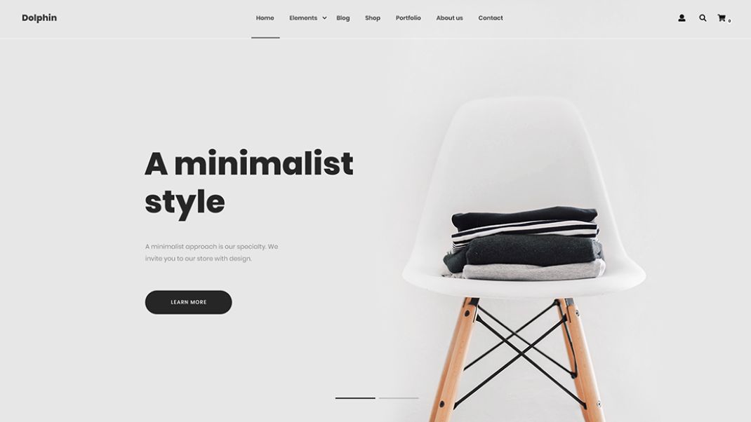
To spot minimalism, look for designs that feel spacious and uncluttered—think fewer buttons, cleaner interfaces, and plenty of breathing room. This design style fits well with content that requires focus or emphasizes aesthetics, like galleries or blogs where visuals do a lot of the talking. It’s all about enhancing the user experience by guiding attention to what’s truly important. If it works - don’t fix it.
Material Design
Material Design is a bit of a “subgenre” of minimalist design in a sense and is all about bringing physical concepts to design interfaces. It was first introduced by Google about 10 years ago now and since it went through 3 revisions, refining the style for more modern standards. The idea is to use shadows, layers, and movement to create a sense of depth, giving the user the impression that elements are tangible and can be manipulated in a realistic way. Some of us associate material design with “card-style” layouts, where you separate content into visually distinct containers, or “cards”.
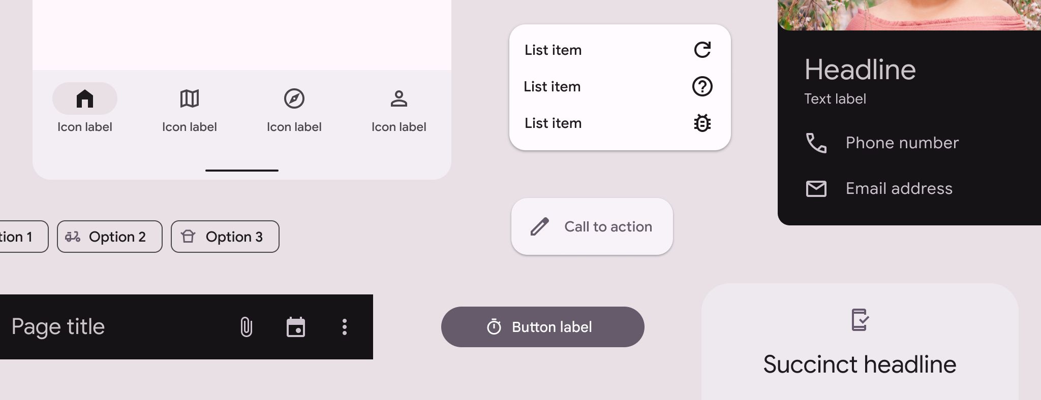
It’s a solid fit for content that’s interactive or requires multiple layers of information, like dashboards, SaaS platforms, news apps, or educational platforms. If you have an Android phone or have used one in the last 10 years, you can associate that type of interface with what I am describing right now, same with other Google products.
Bold Typography
Bold typography is exactly what it sounds like: big, oversized text that immediately grabs attention. It’s not just about size but also using typography as a focal point in the design. You’ll often see it paired with minimalist layouts where text takes center stage, drawing the user in without the need for heavy visuals. This trend is common in branding-heavy industries like fashion, editorial design, or portfolios where a statement can be made through words alone.
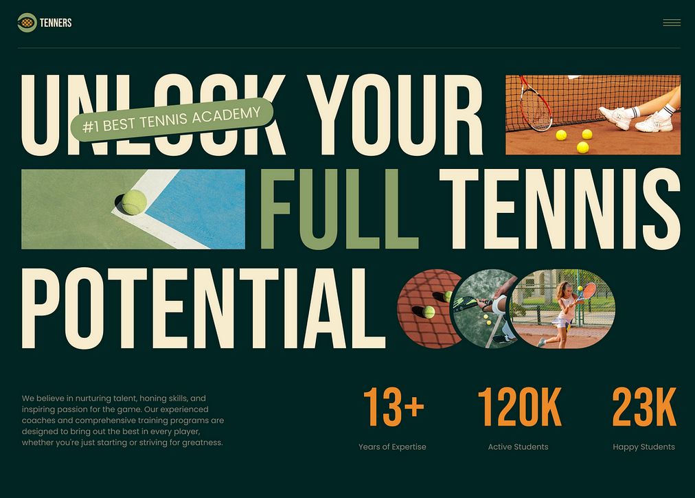
Spotting big typography is easy—just look for the fonts that dominate the page, often spanning multiple columns or sections. It’s perfect for content that needs to deliver a punchy message, whether that’s a headline, a CTA (call-to-action), or a slogan. It works best for websites with a clear, singular focus, like landing pages or promotional sites.
Morphism
Let’s try and move on from minimalism now and discuss some of the cooler Daniels of the bunch. Morphism is a broad term that encompasses several sub-trends like Glassmorphism, Skeuomorphism, and Claymorphism, each with its unique twist.
Glassmorphism mimics the look of frosted glass, often seen with semi-transparent backgrounds and vibrant, floating elements that give an illusion of depth.
Skeuomorphism tries to imitate real-world textures and objects, so you’ll see it in designs that feature lifelike buttons or textures.
Claymorphism takes a softer approach, giving UI elements a 3D, rounded, almost playful feel, with soft shadows and muted colors, usually accompanied by similar style graphics.
These morphic designs are often used in creative industries, gaming, or fintech, where designers want to stand out with a futuristic or playful aesthetic. Glassmorphism, for example, pairs well with apps or platforms looking for a modern, tech-forward look. You’ll spot these designs by their immersive depth, transparency, or exaggerated realism. You can often see elements of Glassmorphism on other websites that generally follow a more minimal design look, but use frosted-glass elements like a centered navigation bar, a sub-menu, etc.
Brutalist Design
Brutalism in UI design takes inspiration from the raw, unpolished look of Brutalist Architecture that emerged in the late 40s to early 50s in Europe. At the time, Europe had just emerged from the most destructive war in history, with widespread devastation to housing stock, commercial buildings, and civic halls. In these circumstances, there was an attraction to architecture that could be designed and executed quickly and efficiently, with a minimum of unnecessary decoration.
In UI Design, Brutalism is characterized by bold, block layouts, stark contrasts, and often very minimal decoration, sometimes appearing almost intentionally unfinished. Visible grids are a distinction of this style, giving designs a structural, almost mechanical feel. Brutalism is a favorite among edgy, rebellious brands, creative agencies, or personal blogs that want to make a bold statement and break away from the more polished, user-friendly designs we typically see.
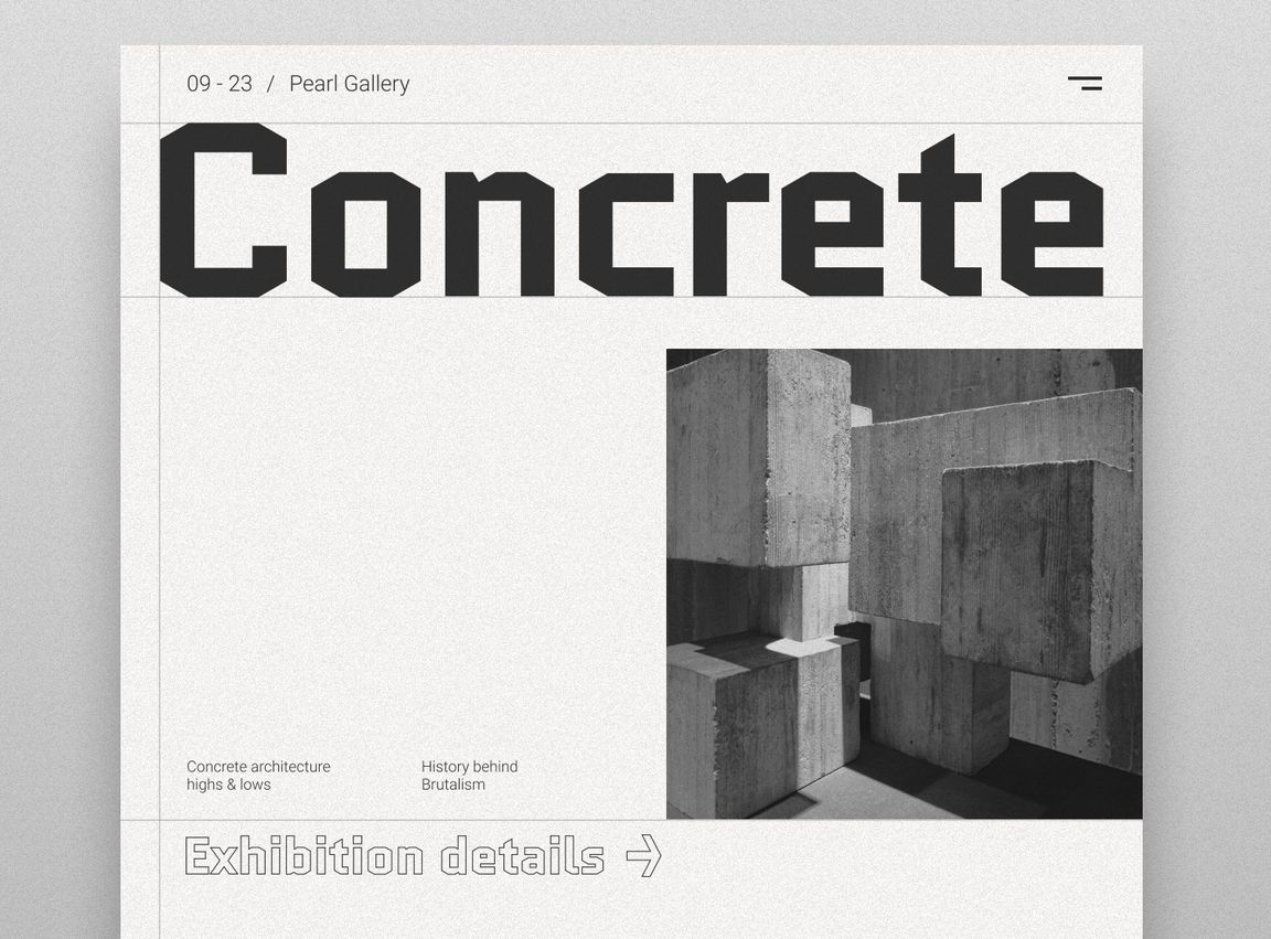
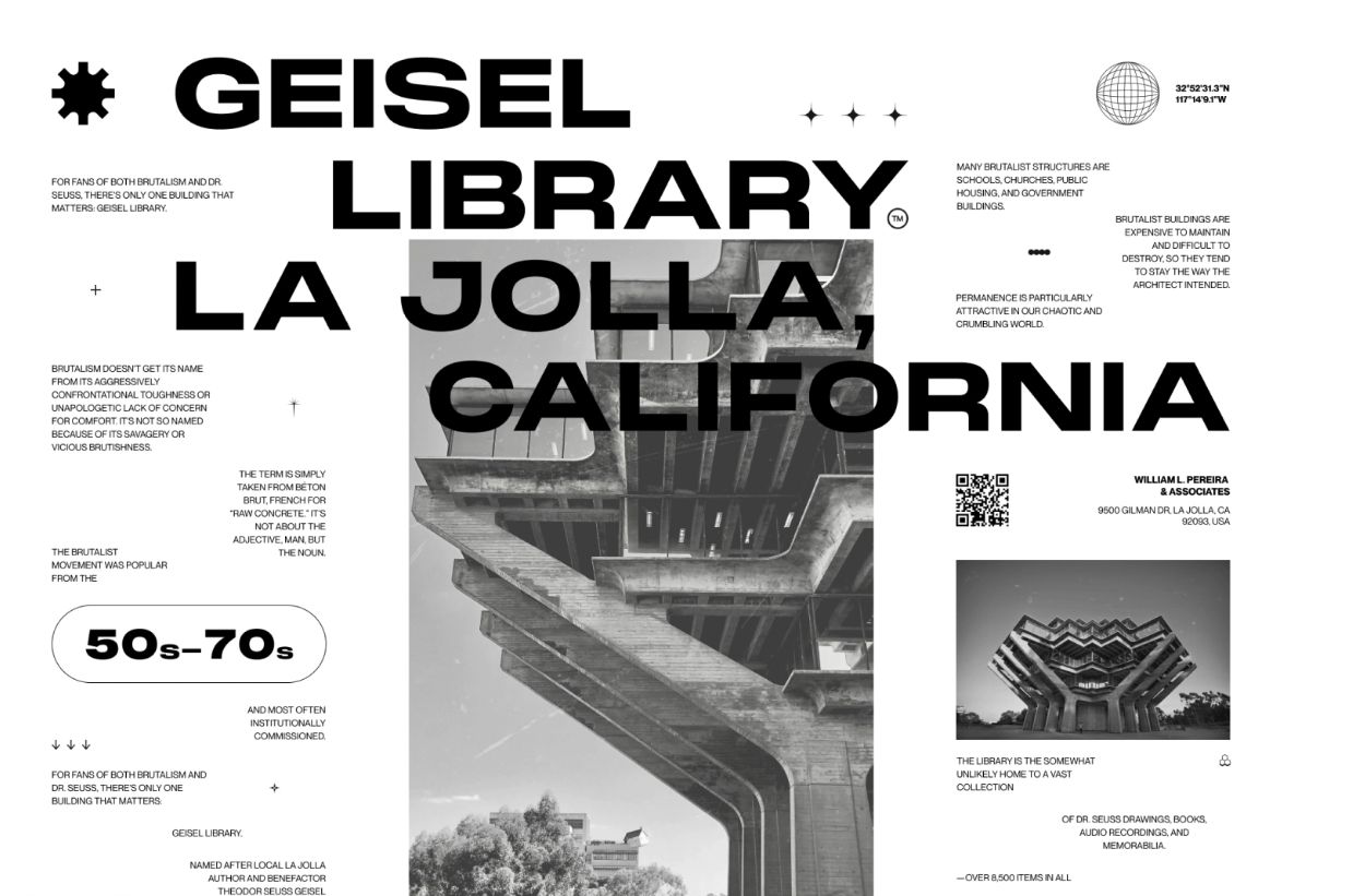
You can spot Brutalist design by its unapologetically raw aesthetic—think harsh lines, oversized fonts, and monochromatic color schemes. It’s a good fit for content that is more experimental or meant to provoke thought, such as art collectives, indie brands, or activist websites.
Bento Style
Last but not least, inspired by bento boxes, which are those Japanese-style take-out food packages that typically include rice and are packaged in a box with a lid.
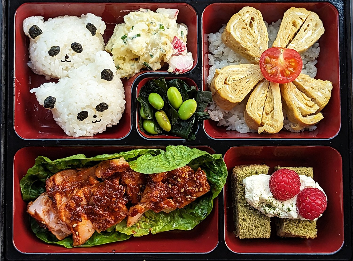
Similarly, Bento-style design breaks content into neatly arranged bite-sized sections. While also comparable to card-style layouts and grid layouts, they’re all about creating a modular interface where different elements (e.g. images, text, videos) are compartmentalized into their little sections. This trend emphasizes organization and clarity, making it a great fit for Product Pages, Dashboards, and even E-Commerce websites where users need to consume lots of information at once without feeling overwhelmed.
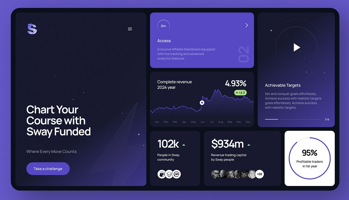
You can spot Bento-style designs by their clean grid layouts, often with each section containing distinct information that doesn’t bleed into the next. This is a good fit for content that requires structure, like product comparisons, online catalogs, or multi-featured service websites.
Conclusion
In conclusion, these UI design trends are either currently dominating the scene or proving to be timeless staples that aren’t going away anytime soon. Each style offers something unique and valuable, depending on your project’s goals. The right design can drastically influence how your website or app is perceived by users, making it important to align your aesthetic choices with your brand’s voice and content.
By understanding and leveraging these design trends, you can create an interface that not only looks great but also resonates with your audience, making your product or service stand out in a crowded digital space.
If you like this type of content, give it a share or drop us a message if you’re interested in starting a project with our team of experts!
'/%3e%3cpath%20class='a'%20d='M80.58,50A26.74,26.74,0,1,1,27.68,58a27.1,27.1,0,0,1,.06-8.05,1.34,1.34,0,0,1,1.91-1l6,2.9a1.33,1.33,0,0,1,.74,1.31,17.51,17.51,0,0,0,0,2.29,17.85,17.85,0,1,0,6-14.65,1.34,1.34,0,0,1-1.49.22l-5.94-2.89a1.34,1.34,0,0,1-.4-2.12A26.73,26.73,0,0,1,80.58,50Z'%20transform='translate(0%200)'/%3e%3cpath%20class='b'%20d='M60,42.13a13.38,13.38,0,0,0-14,1.38,10.84,10.84,0,0,0-1.1,1,9.27,9.27,0,0,0-1,1l-4.1-2-8.11-4h0l-8.06-3.93-6.9-3.36a1.33,1.33,0,0,0-1.76.55c-.66,1.21-1.27,2.46-1.83,3.74a1.33,1.33,0,0,0,.65,1.72l6.91,3.37,8.05,3.92,8.11,4,4.11,2a12.94,12.94,0,0,0-.21,1.39,12,12,0,0,0-.06,1.46A13.37,13.37,0,1,0,60,42.14ZM54.62,60.82a6.7,6.7,0,0,1-6.88-4.75,6.87,6.87,0,0,1-.26-1.38v-.07a6.56,6.56,0,0,1,.58-3.24,6.64,6.64,0,0,1,2.41-2.81h0a5.24,5.24,0,0,1,1.24-.65,6.69,6.69,0,1,1,2.9,12.9Z'%20transform='translate(0%200)'/%3e%3ccircle%20class='c'%20cx='54.15'%20cy='54.15'%20r='54.15'/%3e%3c/svg%3e)