
If you’re a web developer looking to improve your UI knowledge, a seasoned designer, or just getting started, we’re always on the lookout for practical tips that can make our designs not only look better but work better as well.
As a designer, I’ve found the book “Refactoring UI” by Adam Wathan and Steve Schoger to be an invaluable resource. While the book is primarily aimed at developers, I’ve found that many of the principles and techniques discussed can be just as applicable to designers. In fact, I’ve often found myself referencing the book when I’m stuck in a design rut or trying to figure out how to improve the look and feel of a website, which has also been the main influence behind the idea for this article.
One of the things I love about “Refactoring UI” is that it doesn’t just focus on the aesthetic aspects of design, but also on the practical, functional considerations that can have a big impact on the overall user experience. The authors do a great job of breaking down complex design concepts into easy-to-understand, actionable tips that you can start implementing right away.
It’s interesting to note that despite the availability of such knowledge, many websites still overlook basic design principles, resulting in interfaces that feel off (but that’s nothing new, of course). For designers transitioning from a print background, I’d recommend this book in a heartbeat. For seasoned web or UI design veterans, much of the content will be familiar, but there are definitely practical tips that can enhance any design workflow.
This is why I wanted to write an article and give some examples of how these design decisions affect the final product in so many ways that sometimes we can’t even pinpoint what the exact problem is but “it just doesn’t look right”.
But seriously, go buy the book, it’s right here. The guys are great. I hope for a second one. 🚀🚀🚀
Anyway.
Sizes and spacing
Using a consistent design system is key to preventing inconsistencies, especially in a team setting. Learning how to create and use a design system is crucial if you’re in the field, given the plethora of tools available today that let you create reusable components in your [insert design app of choice]. If you’re just starting out, do yourself a huge favor and get familiar with design systems from the get-go.
It’s much easier to learn the right way from the beginning than to re-adapt later. Trust me, your future self will thank you!
Spacing is often overlooked, but it has a massive impact on the final product. You don’t want everything crammed together; you want to give each section the space it needs to breathe. This helps make your design look organized and professional. Proper spacing not only enhances the visual appeal but also makes it easier for users to navigate and understand the layout. When you use spacing effectively, everything feels cohesive, and the overall experience becomes more user-friendly.
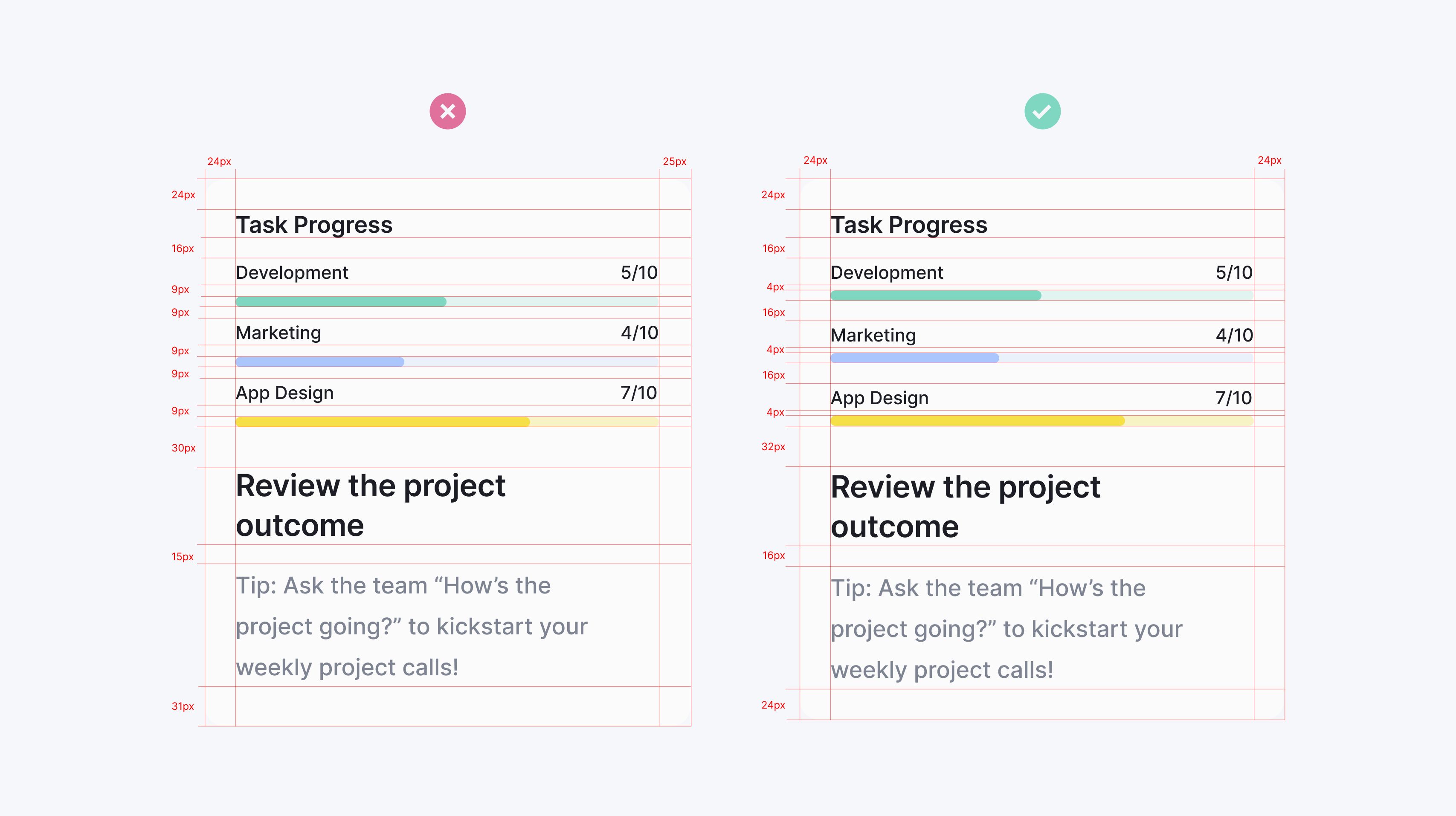
Another note to the example above is how avoiding ambiguous spacing between elements helps with figuring out which labels go to which graph.
This is another great topic discussed in “Refactoring UI”, is to start by giving too much space to your elements and then remove it until you’re happy with the result. This approach is one of the easiest ways to clean up a design. It often gets you visually closer to the perfect amount of white space compared to adding space little by little.
Point grids and scales
There are many ways to define your measurement units, most common being 4 or 8-point grid systems and the progression scales. The reasoning behind it is simple: Considering how display scaling works, an even number makes scaling your design much easier and consistent, avoiding half pixels, and also matching up to the default browser’s font-size of 16px.
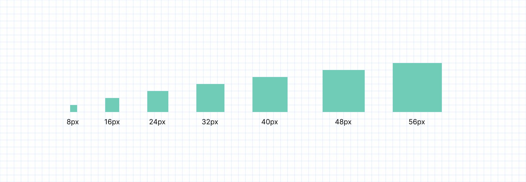
8-point grid system
While many prefer the 4-point grid, for me it feels like the 8-point provides better consistency across projects and is a bit easier to manage, or maybe I just got used to it. What I like to do is take notes on my designs about spacing and font sizes used and group them by function or role, which makes it easier to find an irregularity and fix it before making it to the final draft.
Another popular alternative to point grids is using progressive scales, especially if later in development we use tools such as Tailwind or Bootstrap that come with a predefined scale. The idea behind building these scales is a bit more difficult and requires a little bit of math, but at the end of the day, you get a fairly practical scale built for consistency and efficiency across projects.
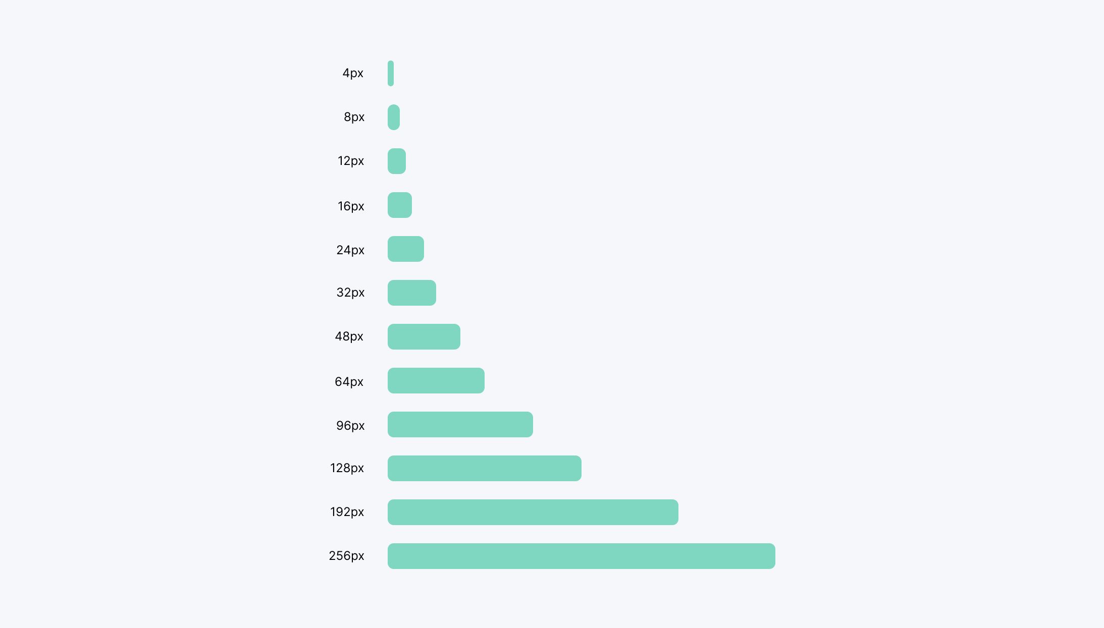
At DART, like many others, we love using cool tools like Tailwind for our projects, BUT.. be careful when using frameworks such as Tailwind that come with extended utilities for controlling text size and spacing, but you still need a system to understand which sizes to use.
You can use Modularscale to check on other scale alternatives you can use. A popular scale to use is the Fibonacci sequence, a scale that occurs throughout nature.
Visual Hierarchy
Talking about sizes and spacing can only lead us to our next topic, which is visual hierarchy.
Now, we shouldn’t rely on sizes alone to control our hierarchy, as that can hurt our design and even make it look outdated. Instead, we can use font weights, colors, and emphasizing elements to achieve a strong visual hierarchy.
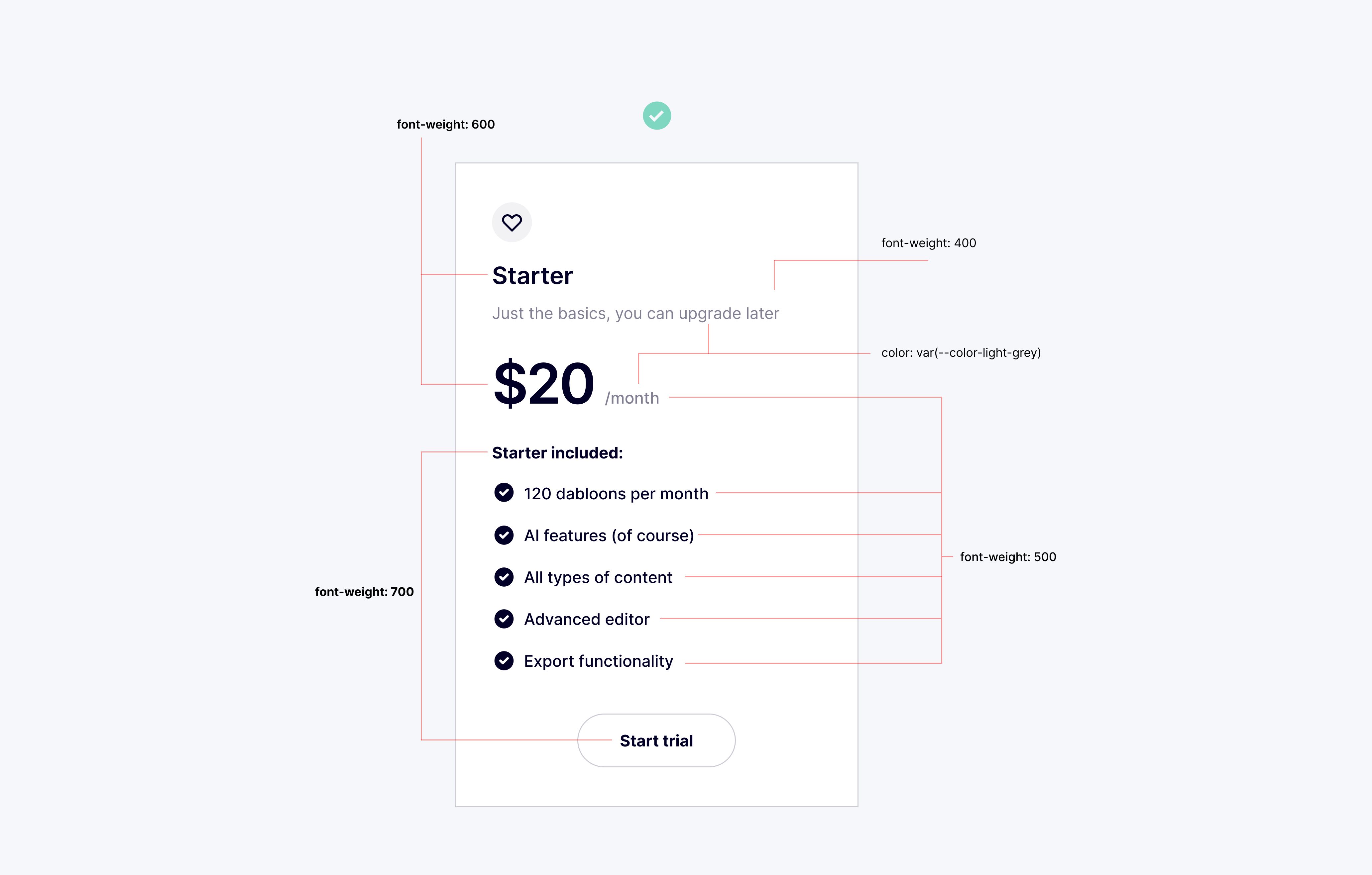
In “Refactoring UI,” the authors discuss how to use these various design elements to create a clear and effective visual hierarchy. By understanding the principles behind visual hierarchy, we can create designs that guide the user’s attention and make the most important information stand out.
Colors and Contrast
The color theory itself is a very complicated yet fascinating topic that could be a separate article on its own. There are plenty of resources on the internet discussing this in detail, yet there are some basics we have to cover in this article.
As mentioned above on the topic of visual hierarchy, color and weight can be very powerful tools in controlling your hierarchy. Instead of making elements bigger or smaller, try using color and weight to emphasize or de-emphasize elements.
Creating a color palette goes far beyond using a simple color palette generator that offers a set of five colors after a few adjustments. Think of those initial colors as just a starting point, a foundation from which you can expand to create a more comprehensive palette. To build a truly effective and versatile palette, you need to consider various shades and tints of your base colors. Start by picking a base color, then generate lighter and darker shades from it.
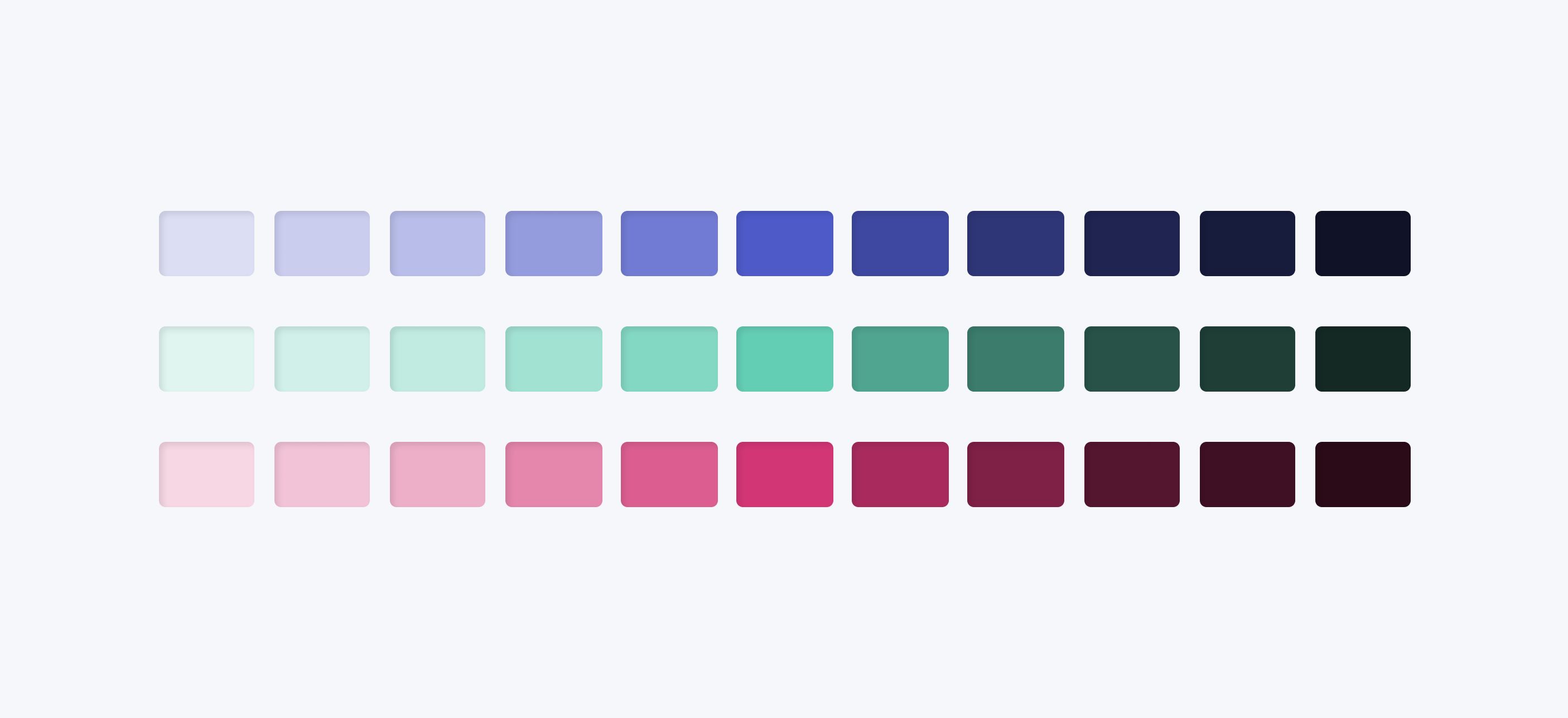
One simple yet effective approach is to go the monochromatic route for your components and use the darker shades for elements like text and borders while reserving the lighter shades for backgrounds and secondary text. This method creates a cohesive look throughout your design and ensures sufficient contrast, making your design visually appealing and easy to navigate. By thoughtfully expanding your palette and considering how different shades interact, you can create a more dynamic and harmonious design.
Ensuring that text is readable on background colors is also crucial for accessibility. Web Content Accessibility Guidelines (WCAG), which are a series of recommendations for making the web more accessible, has a standard regarding colors, that defines two levels of contrast ratio: AA (minimum contrast) and AAA (enhanced contrast). The level AA requires a contrast ratio of at least 4.5:1 for normal text and 3:1 for large text (at least 18pt) or bold text. The level AAA requires a contrast ratio of at least 7:1 for normal text and 4.5:1 for large text or bold text.
If you’re not sure, you can use tools such as Coolors Color Contrast Checker (that’s a lot of Cs) or WebAIM’s.
Use your grid correctly
Don’t be governed by the grid, govern the grid. A grid is like a lion cage - if the trainer stays too long it gets eaten up. You have to know when to leave the cage - you have to know when to leave the grid. - Massimo Vignelli
Using a system like a 12-column grid is a great way to simplify layout decisions and bring a sense of order to your designs. However, leaving all of your layout decisions to the grid can do more harm than good. Sometimes, you may be designing elements that would only get ruined by fluidity, where things start to look a little too wide or too narrow. In these cases, it may be beneficial to give elements a fixed width and only force them to shrink when necessary. Think of modals, sidebars, login cards, etc.
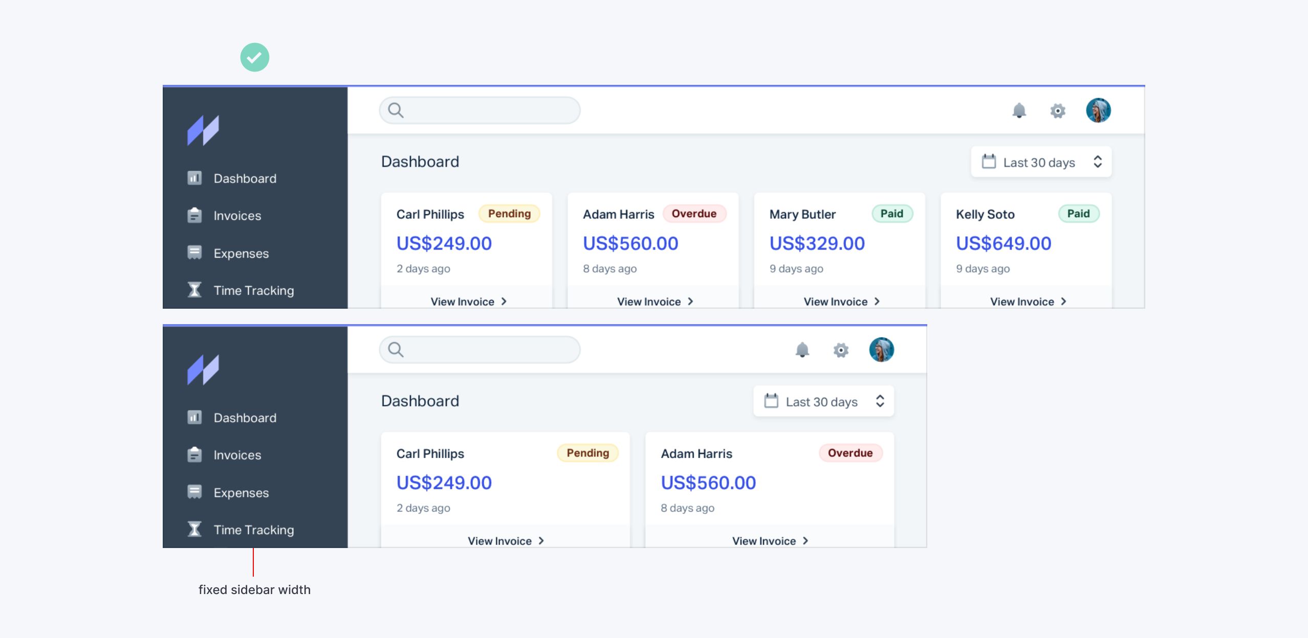
The key is to give your components the space they need and don’t make any compromises until it’s actually necessary. By understanding when to use the grid and when to break free from it, you can create designs that are both visually appealing and functionally sound.
Progressive Disclosure
UX designers often use progressive disclosure to guide users through multi-step processes, presenting just the right amount of information at each step to help them make clear choices. UI designers can also apply this technique to decide what to include in the interface and what to hide.
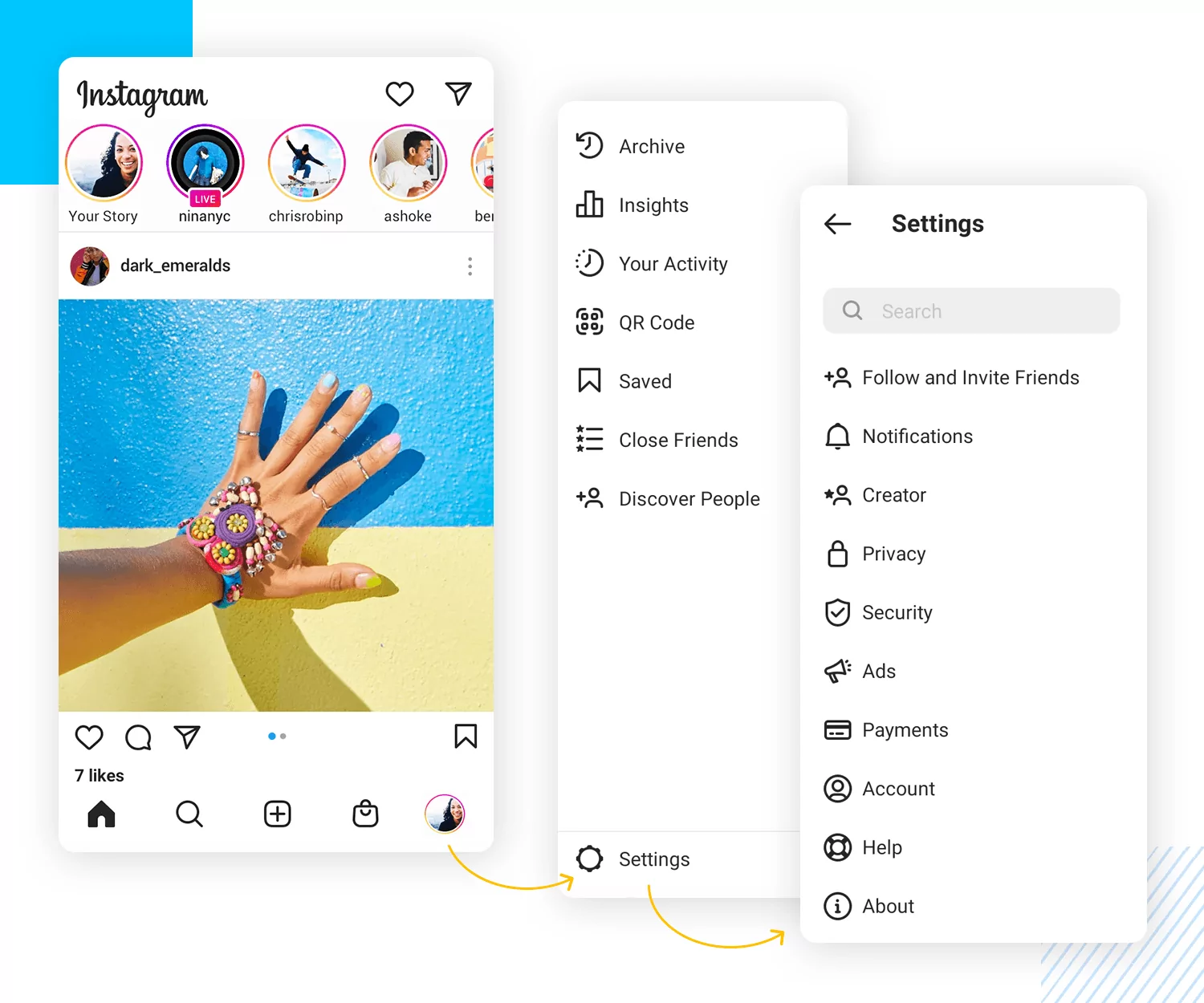
The goal of progressive disclosure is to show users only what they need when they need it, making processes feel less overwhelming and reducing confusion and cognitive overload. For example, on a product page, you might display core information up front while hiding detailed specifications behind accordions, tabs, collapsible menus, sidebars, tooltips, or popovers. This approach not only benefits the user experience by making navigation easier but also keeps the UI clean and uncluttered.
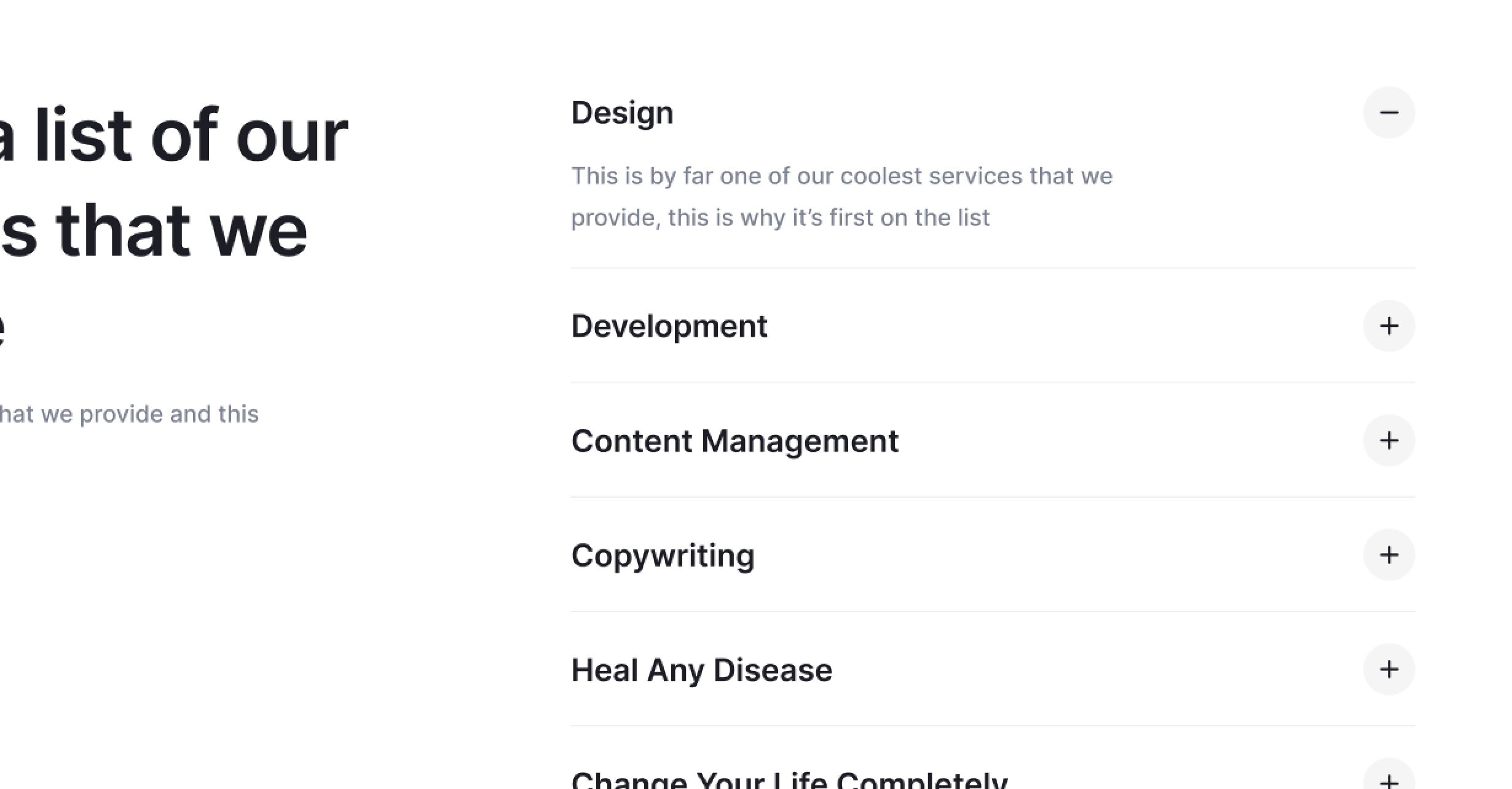
However, it’s important to use progressive disclosure wisely. Misusing this technique can lead to frustration, especially if it makes essential tasks, like canceling subscriptions, signing in, adjusting settings, or buying plane tickets, overly complicated or tedious. Unfortunately, these poor practices are all too common. By spreading awareness of how to use progressive disclosure effectively, we can help improve design practices and create more user-friendly experiences.
I hope these practical tips have given you some ideas to improve your web designs. If this article gets traction, we can turn it into a small series where we discuss different design topics in more detail. Feel free to leave a comment below about what you’d like us to cover next!
